

Constellation will be the future of Pega’s front-end interface for all of its applications. While they will support the traditional section based, Constellation design patterns will become the norm delegating Pega Rules to simply handle the business logic. Unfortunately, there aren’t that many Pega Academy articles going over the specific details on how to deploy a component. Thankfully, there is plenty of documentation to reference so we can get started on learning Pega Constellation DX API so we can start leveraging it.
Step 1:
Make sure you have the latest version of Node.js installed on your machine.
https://nodejs.org/en/download/package-manager
Step 2: Initialize your Local Pega Development Environment
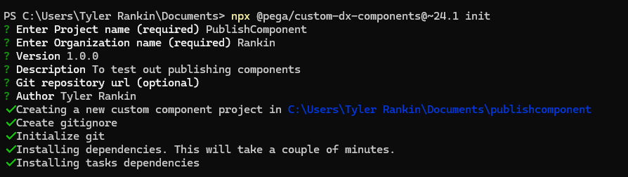
Now within any terminal you want (I’m using PowerShell) enter the following command.
npx @pega/custom-dx-components@~24.1 initThat will initiate a project providing you, as a Pega Constellation Developer, everything you’d need to make components.
Follow the prompts filling out all of the required details.
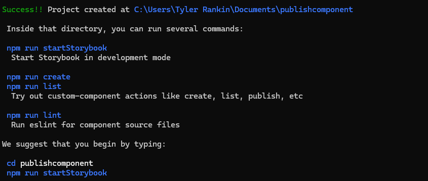
After it’s created you should see success message along with some important commands you can use.
Step 3: Open in Visual Studio Code & Create your first component
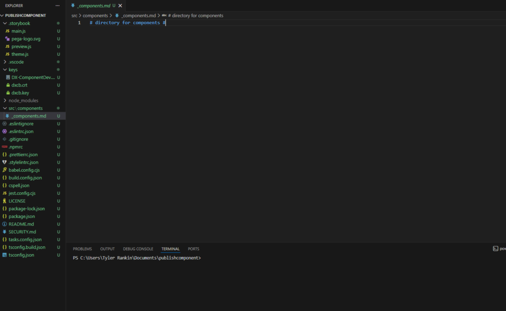
In VS Code, open the project directory.
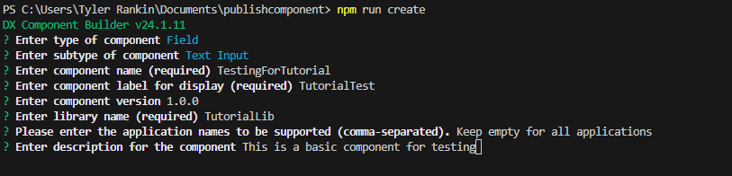
Npm run create
Again, go through some prompts.
If you take a look at your project directory under src/components now you will see the component that we generated.
Now let’s see what this looks like on the UI.
Step 5: Spin Up Storybook
Storybook is a tool that allows you to review components on localhost. And Pega includes it when generating the projects.
npm run startStorybookThis will start a local server, once you open up the tab you should see an application that looks like this.
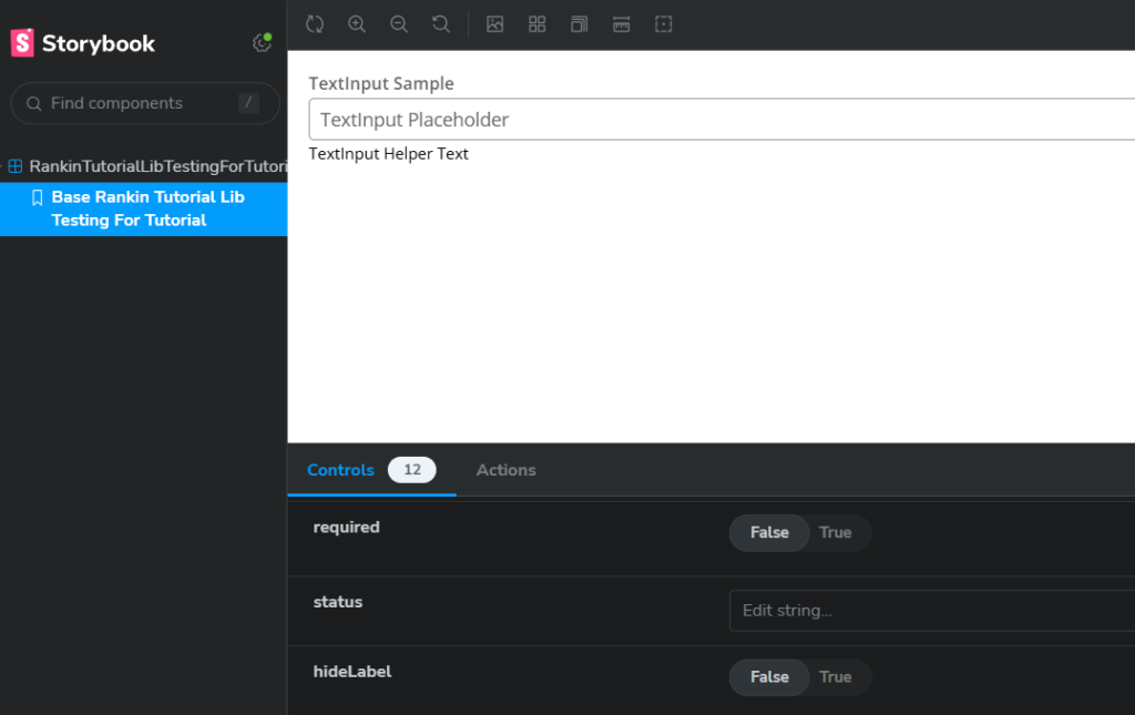
The left tab displays all of the components you’ve made and can preview them within the window on the right.
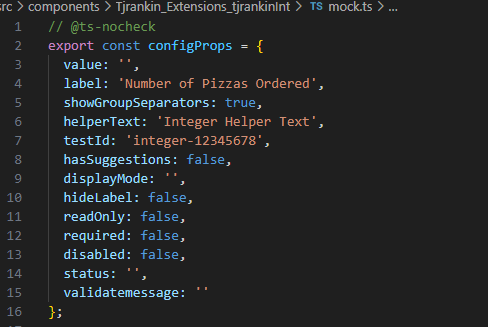
This will also take any edits that you make from within your component and display it here without having to kick the server back up. Open the mock.ts file within your component directory and modify one of its values. I took the label property and changed it to “Number of Pizza Ordered”
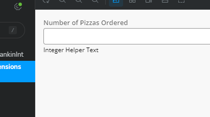
Save your file and without even needing a refresh, you should be able to see your changes.
That’s cool but for a final touch let’s dive into the index.tsx to introduce our own code.
At this point, you will have likely how much boilerplate code Pega generated to capture various scenarios.
But anywhere in the code you can simply introduce this code that will give you your own.
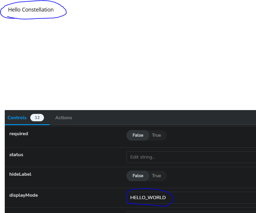
  if (displayMode === 'HELLO_WORLD') {
    return(
            <div>Hello Constellation</div>
    );
  }
The displayMode is a default property that Pega gives you that we can leverage, just make it all caps to make your values work.
Now if you pass HELLO_WORLD into displayMode within Storybook you should see our JSX come through.
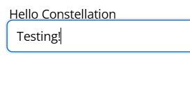
Now last have our last bit of fun by again introducing that text input again. This time in addition to adding <Input/> you will need to implement a wrapper otherwise you’ll get a syntax error.
The system should have auto-generate a wrapper that you could utilize, in my case it was StyledRankinTutorialLibTestingForTutorialWrapper. (Don’t ask me how it came up with that.)
 if (displayMode === 'HELLO_WORLD') {
    return(
      <StyledRankinTutorialLibTestingForTutorialWrapper>
        <div>Hello Constellation</div>
        <Input/>
      </StyledRankinTutorialLibTestingForTutorialWrapper>

    );
  }
Congratulations! You just built and modified your first component in Constellation. Next will look into publishing this into our Pega Platform Environment.
For your hard work, here’s an cute picture of a squirrel courtesy of Pixabay.

References:
Getting Started With Pega React